
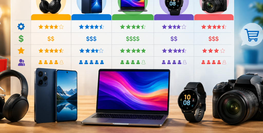
We’ve all experienced it: you open an online store to buy a simple item, only to find six slightly different models with virtually identical photos and endless walls of technical jargon. Within five minutes, decision fatigue sets in. Instead of figuring out which option to pick, you close the tab and walk away.
For e-commerce brands, helping customers cut through that clutter isn’t just about good customer service—it is one of the highest-leverage strategies you can use to reduce cart abandonment, build long-term trust, and drive consistent sales.
What Is a Product Comparison Table?
At its simplest, a product comparison chart is a structured visual layout that places similar items side-by-side. Products sit at the top of individual columns, while their key features—such as price, physical dimensions, battery life, or material quality—run down the rows.
                  SIDE-BY-SIDE COMPARISON
┌──────────────────────┬───────────────┬───────────────┐
│ CORE FEATURES        │ BASE MODEL    │ PRO MODEL     │
├──────────────────────┼───────────────┼───────────────┤
│ Price                │ $49           │ $79           │
├──────────────────────┼───────────────┼───────────────┤
│ Battery Life         │ 8 Hours       │ 18 Hours      │
├──────────────────────┼───────────────┼───────────────┤
│ Water Resistance     │ Splash-proof  │ Fully Submersible│
└──────────────────────┴───────────────┴───────────────┘
Depending on your store’s setup, these charts generally take two forms:
- Static Comparison Grids: Hand-crafted tables designed by the merchant to highlight popular product lines, tiered pricing packages, or demonstrate how a flagship product compares directly to top market competitors.
- Dynamic Modules: Interactive tools built into the storefront that allow visitors to choose and swap specific items from your catalog to compare them on demand.
The Real Business Value of Comparison Modules
Adding side-by-side charts to your product pages does far more than just polish up your store’s appearance. It directly addresses the friction points that prevent people from completing a purchase.
Stopping the High-Bounce Cycle
When prospective buyers get stuck trying to determine which product variant actually meets their needs, they leave to do research elsewhere. Giving them an instant way to evaluate choices directly on the page keeps them on your site. Interactive features encourage shoppers to compare, explore, and stay engaged until they feel confident enough to hit “Add to Cart.”
Earning Immediate Customer Trust


Shoppers are naturally skeptical of marketing claims. Presenting product specifications in a transparent, easy-to-read grid signals that your business has nothing to hide—even when showing entry-level limitations. That honesty creates instant credibility, making visitors far more likely to return down the road.
Boosting Organic Search Visibility
Engaging design elements keep visitors on your web pages significantly longer, sending strong quality signals to search engines. On top of that, linking related product pages together within your comparison tables creates a healthy, interconnected site structure that search engines love to crawl.
6 Practical Guidelines for Designing Great Charts
A cluttered or confusing chart can turn buyers off just as quickly as having no information at all. Here is how to keep your visual tables clean, helpful, and effective.
                FEATURE HIERARCHY IN CHARTS
┌─────────────────────────────────────────────────────────────┐
│ 1. VISUAL & PRICE    --> Product photo, title, and cost     │
├─────────────────────────────────────────────────────────────┤
│ 2. HERO FEATURES     --> Main selling points & top specs    │
├─────────────────────────────────────────────────────────────┤
│ 3. SECONDARY DETAILS --> Dimensions, materials, or weight   │
├─────────────────────────────────────────────────────────────┤
│ 4. FINE PRINT        --> Warranty info, certifications      │
└─────────────────────────────────────────────────────────────┘
Cap the Number of Displayed Items
Keep your comparisons focused on three to five products maximum. Trying to force too many columns onto a single screen results in tiny text, horizontal scrolling, and visual chaos. For larger stores, rely on interactive selectors so customers can view just a few items at a time.
Put the Most Important Details Up Top
Position your main selling points—like product photos, price, primary use cases, and key capabilities—right at the top of the chart. Leave lower-priority technical specs for the bottom rows, where shoppers who want to dive deeper can scroll down without cluttering the initial view.
Make It Visually Digestible
Incorporate clear product photos, subtle background shading, and intuitive symbols like checkmarks or dashes. A well-constructed chart lets a visitor scan down the page and absorb the main differences in just a few seconds.
Organize Products and Rows Logically
Structure your table so it follows a natural flow. If you sell consumer electronics, arrange products from basic to advanced (or vice-versa). Ensure your attribute rows follow a sensible order too, putting the most frequently asked questions near the top.
Compare Apples to Apples

Select specs and features that apply to every single item in the grid. Leaving rows full of “N/A” markers or empty gaps makes the table feel incomplete and unhelpful. If a feature is exclusive to a top-tier model, list it under a broader feature category that applies across the board.
Keep It Simple (Skip the Manual)
A comparison table is a quick decision tool, not a full instruction manual. Limit your rows to the handful of attributes that actually influence buying decisions, and leave deep technical breakdowns for the dedicated product detail pages.
Real-World Playbook: How Brands Outshine Competitors
To see this approach in action, look at how direct-to-consumer wellness companies structure their landing pages. A brand selling daily supplement powders or functional coffee might place a table right on their homepage comparing their product against well-known market alternatives.
Instead of bogging readers down in exhaustive ingredient lists, they focus on four or five major selling points:
- Quality of Ingredients: Highlighting organic, unrefined ingredients versus cheap fillers.
- Texture and Mixability: Showcasing smooth dissolving formulas that leave zero grit or residue in the glass.
- Sourcing Standards: Emphasizing premium, ethically sourced components over mass-market substitutes.
- Third-Party Testing: Highlighting certifications, Non-GMO badges, or independent lab checks.
Using bold highlights or distinct background colors on their own column while keeping competitors’ columns neutral communicates why their product is superior in seconds.
Adapting Your Tables for Mobile Shoppers

Since most online browsing happens on smartphones, your comparison layouts have to look great on smaller screens. A massive grid that looks slick on a widescreen monitor will quickly fall apart on a mobile screen if it isn’t formatted properly.
Here are three effective ways to optimize charts for mobile devices:
- Use Expandable Rows: Let mobile users tap section headers (like “Dimensions” or “Performance”) to expand or hide specific feature rows as they scroll.
- Freeze Your Headers: Keep the product image, title, and purchase button visible at the top of the screen while the user scrolls down through the detailed feature rows.
- Enable Horizontal Swiping: Allow visitors to swipe side-to-side through product columns while keeping the row labels locked on the left side of the screen.
Giving Buyers the Clarity They Want
At the end of the day, online shoppers don’t want to spend their free time digging through endless open tabs just to figure out basic product differences. They just want clear, honest information so they can feel good about where they spend their money.
By organizing your catalog into clean, intuitive, and mobile-friendly comparison charts, you remove the guesswork from the buying process. You make shopping enjoyable, lower your site’s bounce rate, and create an open, transparent experience that keeps customers coming back.
FAQ’s
1. What are product comparisons?
Product comparisons help you evaluate different products based on features, price, quality, and value.
2. Why should I compare products?
Comparing products can help you make a smarter buying decision and find better value.
3. What should I compare before buying?
Consider price, features, quality, performance, reviews, warranty, and overall value.
4. Are product reviews important?
Yes. Reviews can provide useful insights into real-world performance and customer experiences.
5. How do I choose between similar products?
Compare the features that matter most to you and choose the option that best fits your needs and budget.